migovr_blog_web_design_css

CSS Animation Trends in Web today

The web is an ever-evolving medium propelled forward by enthusiastic developers and creators. Animation is just a slice of web design that has risen to high acclamation in recent years. The methods and techniques for adding motion to an interface may have changed, but the end result is still a lively design with charming interactive tendencies.

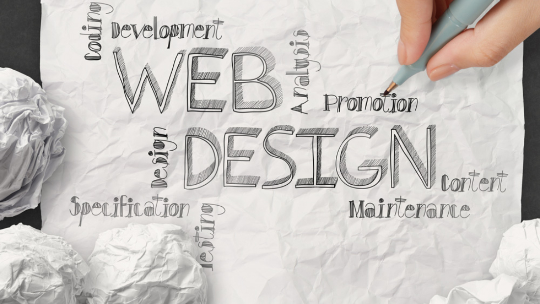
The following trends are a catalog of the current era in website animation. While JavaScript is a fantastic animation language, CSS has become easier and heavily supported by the design community. By embracing these newer CSS techniques you’ll stumble down avenues of unique animation and exciting design trends for years to come.

Homepage trends

Aesthetic appeal in web design can be generated through various means. And while everyone can appreciate beauty, the self-proclaimed aesthetes will surely notice the power of beautiful animation.

A website’s homepage can be improved through branding, icons, illustrations, or any number of added features. Once the underlying user experience has been created, it’s easier to focus on a layer of colorful graphics and spicy design techniques. Animation is one such technique that can really spice up a homepage to draw attention from new visitors.

Content Galleries & Slideshows

Interactive page elements can also utilize animation for a snappy response to user input. Mobile touchscreen apps were the first to pioneer the concept of immediate response based on the user’s action.

For example Google’s Material Design & Apple’s iOS both support multiple animation styles. Users can swipe, tap, touch & hold, pull down, pinch & zoom, among other alternatives. These interactions will create different animations based on the operating system’s UX guidelines.

Take a look at the Apple Mac website near the top of the page. It has a product slider featuring all of the various Mac products. On first pageload each item will animate and fade into the slider. Then as you click between different categories the items will animate in from the side.

What’s interesting about this effect is motion applied to each item. When moving to the right new items will animate in like the slider panned over to the right. When moving back it’ll actually feel like the slider is panning back like a video camera. This elastic animation makes the website feel more “alive” as if it behaves according to the natural laws of gravity and motion.

Form Input Fields

Another interactive element is the ever-popular web form. Most forms are comprised of various elements like text fields, radio buttons, checkboxes, select menus, and other thingamabobs.

Animated forms behave just like content sliders – they give a sense of life to user interactivity. Users enjoy seeing a response from their click, scroll, or keypress event. The default browser response is often fine, but adding that little extra oomph to your form can make all the difference.

Sliding Navigation

There’s a big juicy hodgepodge of navigation styles to choose from – and unsurprisingly most of them can be animated. Many designers think of the hamburger sliding menus like you’d find on the Comedy Central or Supereightwebsites. But this is perhaps the obvious answer to sliding navigation.

Expansive Page Motion

Perhaps the most difficult and high-risk style of web animation is a layout based on many various animated elements. There is no official name for this technique but the idea follows that a designer would create lots of different animations for the pageload, along with user interactions like mouse hovers.

It’s risky because this can slow down a great website to a crawl with too much JavaScript. Running too many animations in sequence can be disastrous – but placing them in sync with a natural rhythm can make one of the most dynamic interfaces on the web.

SVG Animation

One of the newer standards into the field of web animation is SVG. These are vector-based graphics which can be rendered, resized, and scaled naturally without any quality loss. Adobe Illustrator is the most popular program for creating SVGs but there are other alternatives.

Final Thoughts

All of these trends have come together through an advancement of frontend technologies and browser standards. CSS animation is a powerful feature that has recently been gaining serious traction.

I hope these trends can offer a picturesque look into the modern state of web design and the potential future of CSS web animation.

migovr_blog_bad_design

7 signs your design style is out of date!

If you’ve worked in the design industry for any length of time you have probably seen styles come and go. Maybe you’re using some styles that are so popular they’ve reached their saturation point. Or maybe you haven’t even realized the possibilities that come with the constant influx of new technology. Whether or not you’ve already noticed the changing times, here are seven signs your design is stuck in the past.

You think serifs are a thing of the past

You’ve seen brands, such as Google and the L.A. Clippers, recently opt for a sans serif logo. Do you know why? The low-resolution of mobile phones and tablets made sans serif type the best choice for easy readability on mobile. However, 4K is on the rise and resolution on mobile keeps getting better. What does this mean? That’s right, serif typefaces are already making a comeback in digital design thanks to high definition screens.

You are constantly trying to keep up with the latest color trends

Every year there’s a debate on the best color of the year. Pantone named Rose Quartz and Serenity the joint Color of the Year for 2016, yet Behance found Bright Red to be the most used color for its users. Communication Arts editor Rebecca Huval argues chartreuse has become the go-to color for startups’ office décor. The point is, it’s not about what color you choose, it’s how you use it. Don’t overdo it with an explosion of colors. Consistent, color saturated design ensures your work will stand out among others and look great on mobile – even with reflection. No matter the color, it’s all about being bold and making a statement.

You do all of your work sitting at a desk

You never know when inspiration will strike, and it’s important to capture that inspiration immediately. Why wait until you’re back at your desk? Not only is distraction a key variability in creativity, but the iPad Pro and Apple Pencil give designers a more paper-like experience that makes it easy to sketch out and play with your ideas from anywhere. The benefit is that these mobile apps make it easy to put your ideas into production without the need to scan and trace.

It’s said the best camera is the one you have with you, so use your phone to capture content or an app for colors, shapes, and brushes. Those elements are then instantly available on your desktop when you’re ready to sit down.

You think from only one perspective

You scroll through Instagram and your feed is full of selfies and over filtered, blasé landscapes. You don’t want your designs to be #basic, so it’s important to change perspective. Literally. Adobe’s Scott Braut recommends incorporating candid portraits into your designs or a cityscape from an interesting angle. Not a photographer? No sweat – stock imagery is a great way to start using striking images in your designs. You can even take it one step further by adding your own illustration on top of these images.

migovr_blog_deisgn

You take throwbacks too far

Despite cleaner high-definition screens, gradients – which harken back to the early days of the Web – made a comeback in 2015. We also saw popularity of a coloring approach to logo design gain momentum, possibly triggered by or the catalyst for the popularity of adult coloring books, and the rise of four pointed sparkle in design, skeumorphism and hand lettering. When it comes to these “cyclical trends,” use them appropriately. They’re great for temporary projects (eg. a music festival or new app) but not applicable for a company’s branding that will probably be around for a decade.

Your flat design is falling flat

Flat design has become hugely popular for designers. Just like the cyclical trends noted above, the reoccurrence of flat design is a normal cycle in the design industry. Despite its current popularity, sometimes this style can be repetitive and, many have argued, boring. Break the mold with depth.  And I don’t mean by adding a drastic gradient and drop shadow, both being sure signs of an amateur. Something more subtle, like what’s used in material design – a top design trend of 2016. Creating depth is more subtle and layered than most people realize.  There are wonderful tools allowing for multiple layer effects and the flexibility to set a design apart in the flat world of screens.

Your templates are looking like… templates

When it comes to creating online content, especially for small businesses, templates seem to be the path of least resistance. The issue is, no matter how good the template is, it still looks like a template.For most designers who pride themselves in “hand-craftsmanship” and “uniqueness,” this is pretty much a non-starter. And let’s not forget when the client asks for something the template can’t do.

Rather than diving deep into the world of development for the sake of the craft there are other solutions which allows designers to create websites with total flexibility. The best part is, no coding is required.

migovr_blog_01

What constitutes bad design?

Some of the most common issues with difficult-to-use sites are:

  • Poor legibility: a wide range of fonts and clashing colors can make a site hard to read, especially when it features lengthy posts
  • Confusing navigation: if a user can’t figure out how to find what they’re looking for on your site, or can’t tell where a link will take them (MMN), they’re not likely to stick around for long.
  • Slow performance: if you’re using a lot of scripts, images and animations, your site will take a while to load and bog down your users’ devices.


Mystery meat navigation (also known as MMN) is a disparaging term coined in 1998 by Vincent Flanders, author and designer of the website Web Pages That Suck, to describe a web page where the destination of the link is not visible until the user points their cursor at it. Such interfaces lack a user-centered design, emphasizing aesthetic appearance, white space, and the concealment of relevant information over basic practicality and functionality.

migovr_blog_responsive_design

Tips for responsive design

Test Your Design on Actual Devices

Planning how your design will scale for different sizes is an important part of designing for those devices, but you cannot stop at that theoretical approach.

Being able to interact with your design on real devices will show you how it really works, either confirming the decisions you made or showing you where improvements may need to be made.

In addition to your own testing, running usability tests with actual users is another important part of working with your designs in a real world setting.

First check existing analytics to see the percentage breakdown for users based on devices. Prioritize your tests based upon the breakpoint information. If you’re moderating the tests on-site, it’s also worth purchasing commonly used devices 

If you can spare the resources, it’s worth testing different devices with different users. While this multiplies the number of users required for testing, it is the safest way to prevent bias due to design familiarity. For example, if you’ve designed three breakpoints, testing with 15 users (five per breakpoint) will help you uncover most usability issues. Services likeUserTesting help scale usability testing affordably since they handle the recruitment, task creation, moderation, and analysis.

If you’re particularly tight on timing or money, you can test multiple breakpoints with the same users. Just randomize the order of devices presented to minimize the bias from design familiarity. For example, if you test mobile, tablet, desktop with User A, switch up the order for User B.